1. Select the data.
2. On the Insert tab, in the Charts group, click the Histogram symbol.

3. Click Histogram.
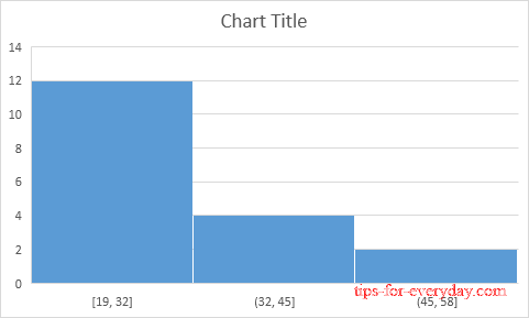
Result. A histogram with 3 bins.

Note: Excel uses Scott's normal reference rule for calculating the number of bins and the bin width.
4. Right click the horizontal axis, and then click Format Axis.
The Format Axis pane appears.
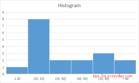
5. Define the histogram bins. We'll use the same bin numbers as before (see first picture on this page). Bin width: 5. Number of bins: 6. Overflow bin: 40. Underflow bin: 20.
Result:

Histogram Chart
Recall, we made the following histogram using the Analysis ToolPak (steps 1-12).
Conclusion: the bin labels look different, but the histograms are the same. ≤20 is the same as 0-20, (20, 25] is the same as 21-25, etc.
